
The Influence of Natural Colors on Mood and Mental Balance
Colors shape human experiences in subtle yet powerful ways. From the calming blue of a clear sky to the grounding brown of tree bark, natural colors have a unique ability to influence emotions, thoughts, and overall mental well-being. Unlike harsh artificial tones, colors found in nature often create feelings of safety, comfort, and emotional stability. Their impact goes beyond aesthetics, affecting how people think, feel, and interact with their surroundings.
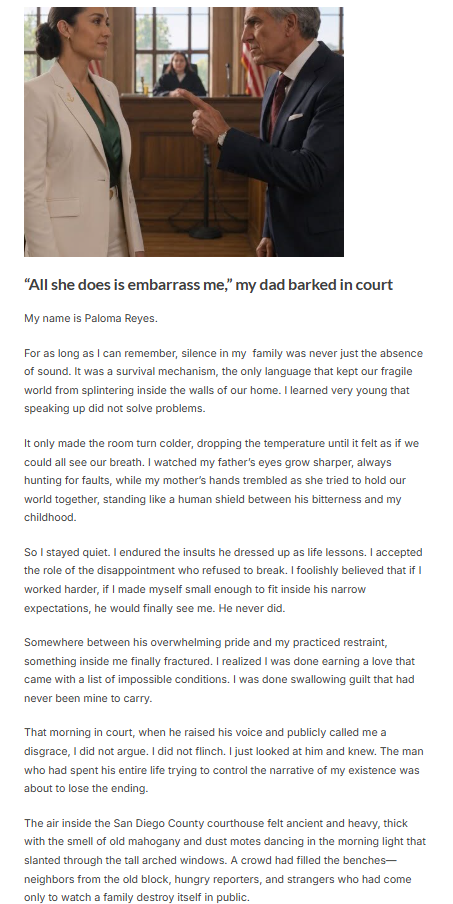


In modern lifestyles filled with screens, artificial lighting, and urban environments, people are often surrounded by overstimulating visual input. Bright neon signs, synthetic materials, and overly saturated colors can create mental fatigue over time. Natural colors, by contrast, tend to soothe the nervous system and promote inner balance. This is one reason why natural design elements have become increasingly popular in homes, workplaces, wellness spaces, and digital environments.
Understanding Natural Colors and Their Psychological Effect
Natural colors are shades commonly observed in the environment, including greens, blues, browns, beige tones, warm terracotta shades, soft grays, and muted yellows. These colors are less visually aggressive than artificial tones and are often associated with organic patterns, landscapes, and familiar environmental cues.
The human brain has evolved in close connection with natural surroundings. For thousands of years, survival depended on interpreting environmental signals such as green vegetation, blue water, and earthy landscapes. As a result, the mind often associates these colors with stability, nourishment, safety, and restoration.
Exposure to these tones can trigger psychological responses linked to calmness and emotional regulation. This makes natural colors particularly effective in spaces designed to support focus, relaxation, creativity, and healing.
The Calming Power of Green
Green is perhaps the most recognized natural color linked to emotional balance. It symbolizes growth, harmony, renewal, and life itself. Found in forests, plants, grasslands, and gardens, green creates a sense of freshness and stability.
Psychologically, green is associated with reduced stress levels and improved concentration. It offers visual comfort because it sits at the center of the visible color spectrum, making it easy for the eyes to process. This reduces visual strain while encouraging a more balanced mental state.
Many workspaces and study environments incorporate green accents because of their ability to support sustained attention and reduce mental fatigue. In homes, green tones can create peaceful living areas that encourage rest and emotional grounding.
Blue and Emotional Relaxation
Blue is strongly associated with the sky, oceans, rivers, and open spaces. It often evokes feelings of tranquility, spaciousness, and clarity. Natural shades of blue tend to slow mental overstimulation and encourage deeper emotional calm.
Soft blue environments can support relaxation after mentally demanding activities. Bedrooms, meditation spaces, and quiet zones often use muted blue tones because they create a cooling and stabilizing atmosphere.
Blue is also linked with trust, reflection, and order. This makes it useful in settings where emotional stability and clear thinking are priorities. However, softer natural blues are generally more effective than highly saturated or electric variations, which may feel artificial or overstimulating.
The Grounding Effect of Earth Tones
Earth tones include browns, taupe, sand, terracotta, clay, and muted beige shades. These colors reflect soil, stone, wood, and natural minerals. They create a strong sense of grounding and physical comfort.
Brown tones are psychologically linked with reliability, warmth, and support. Unlike brighter colors that demand attention, earthy hues promote steadiness and familiarity. This can help reduce feelings of chaos or emotional instability.
In interior spaces, earth tones often create a welcoming environment that feels stable and safe. Their neutral quality also allows the mind to rest without constant stimulation, supporting emotional regulation over longer periods.
Warm Natural Shades and Emotional Comfort
Muted yellows, warm creams, soft oranges, and golden natural tones are commonly found in sunlight, autumn leaves, dry grasses, and sand landscapes. These colors introduce warmth without excessive intensity.
Warm natural colors are often associated with optimism, comfort, and emotional nourishment. They can gently elevate mood while preserving a sense of calm. In spaces where social connection matters, such as dining rooms or shared living areas, warm tones can create a welcoming and emotionally supportive atmosphere.
Unlike bright artificial yellows or oranges, natural warm shades are less likely to feel overwhelming. Their muted quality makes them emotionally accessible and visually comforting.
Gray and Soft Neutral Balance
Natural grays inspired by stone, fog, clouds, and weathered materials can provide visual simplicity and mental clarity. While overly dark gray can feel heavy, lighter natural grays create balance by minimizing distraction.
Soft neutral palettes are especially useful in environments where focus and reflection are important. These tones create a visual pause, allowing the mind to process information without excessive sensory input.
Minimalist spaces often use gray as a stabilizing backdrop combined with warmer natural elements to avoid emotional coldness.
Natural Colors in Home and Work Environments
The spaces people inhabit directly influence daily mood and cognitive performance. Incorporating natural colors into home and work environments can significantly improve emotional balance and reduce visual stress.
Living rooms benefit from greens, beige tones, warm browns, and muted blues to create relaxation and connection. Bedrooms often perform well with soft blues, sage greens, warm whites, and earthy neutrals that support restfulness.
Workspaces can use balanced greens, warm woods, and muted neutrals to encourage concentration and reduce mental overload. Even small adjustments such as natural-colored decor, wall art, furniture, or textiles can create noticeable psychological benefits.
Digital Environments and Visual Wellness
Modern life includes constant interaction with digital screens. Many interfaces rely on bright contrasts and intense colors that contribute to visual fatigue and overstimulation. Introducing natural-inspired digital palettes can improve user comfort and emotional response.
Muted greens, warm neutrals, and softer blue tones are increasingly used in digital wellness applications, productivity tools, and reading platforms. These choices help reduce eye strain while supporting calmer interactions with technology.
Natural colors in digital spaces may also improve focus by reducing unnecessary visual competition.
The Connection Between Nature Exposure and Color Response
Natural colors are most effective when paired with actual exposure to nature. Outdoor environments provide full-spectrum visual experiences that reinforce the calming associations of these colors.
Time spent in parks, forests, gardens, or near water exposes individuals to dynamic natural palettes that continuously shift with light, weather, and seasons. This variety stimulates the brain in restorative rather than exhausting ways.
Even when direct access to nature is limited, bringing natural colors indoors through plants, textiles, wood finishes, and nature-inspired decor can partially recreate these benefits.
Conclusion
The influence of natural colors on mood and mental balance is both deeply psychological and biologically rooted. Greens encourage harmony and focus, blues promote relaxation and clarity, earth tones create grounding and safety, while warm natural shades provide comfort and emotional nourishment.
In a world increasingly filled with artificial stimulation, reconnecting with natural color palettes offers a simple yet meaningful way to improve emotional well-being. Whether through home design, workplace choices, clothing, or digital environments, integrating nature-inspired tones can support a calmer, more balanced state of mind.
By surrounding ourselves with colors that mirror the natural world, we create environments that gently remind the brain of stability, restoration, and connection. These subtle visual cues can play an important role in maintaining long-term mental balance and emotional resilience.